

In competitive visual markets, attention is currency, and most brands are broken. You’re
not just designing for aesthetics, you’re engineering a first impression. One scroll, one
glance, one glance away from being forgotten. That’s why marketing teams need more than
decent visuals, they need assets built to arrest motion and convert curiosity. Winning
brands know that clarity, rhythm, and precision outplay flash. This isn’t about standing out
louder, it’s about standing out smarter.
Use contrast that earns attention, not confusion

If your layout makes the eye work too hard, the customer won’t. Start with separation: Give your message breathing room by removing distractions and focusing on key points.
When used with restraint, bold color choices that guide attention make important elements
pop without overwhelming the page. A sharp button or bright accent on a neutral canvas
will almost always outperform cluttered color explosions. Direct the gaze, don’t just
decorate. Good contrast feels inevitable, not forced. Anchor memory by repeating what works
Customers trust what they recognize, and recognition comes from repetition, not
reinvention. Your visuals should echo across every channel: same color usage, font
hierarchy, and spatial rhythm. Brand equity is built through discipline, not novelty. The
moment your Instagram feed stops resembling your landing page, trust starts to leak.
Consistent branding builds trust across channels by reducing cognitive friction and
reinforcing identity with every touchpoint. Make your brand feel like one story, not a dozen
drafts.
Design layouts that make decisions easier

Most customers don’t bounce because of content; they bounce because they can’t figure out
where to look. Visual hierarchy is your silent salesperson, directing attention from the
headline to the offer to the action. Without it, everything competes; nothing converts.
Effective pages are mapped like flowcharts, not murals. You need tension, emphasis, and
guidance baked into the layout itself. The effects of visual hierarchy on reading patterns
determine how long someone stays before making a move or moving on.
Use data to shape your visual bets
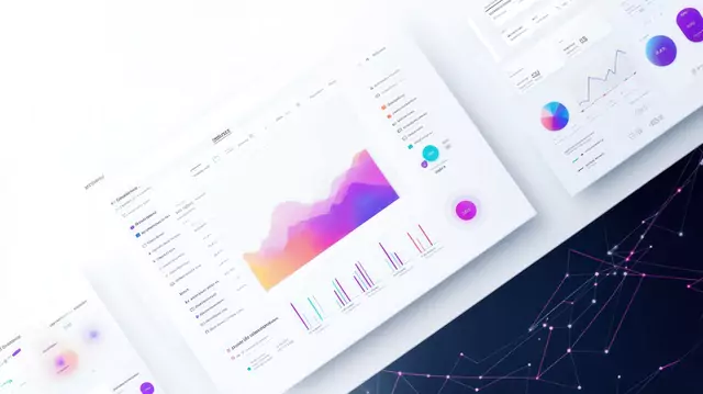
Design doesn’t have to be guesswork. Behavioral analytics can surface which visuals earn
attention, which layouts lead to action, and which formats quietly fail. When you map visual
output to audience behavior, you stop designing in a vacuum. Strong teams pair a visual
strategy with performance data to continuously refine what gets built. The real benefit of
data visualization isn’t dashboards, it’s feedback loops. Design, measure, adjust, repeat.
Make your imagery do more than look good
Forget the overused stock photos and sterile product renders—those just take up space.
Instead, invest in visuals that create a sense of intent: show, don’t suggest. People respond
to images that feel real, specific, and tied to context. Texture, angle, and subject matter
shape how trustworthy and professional your brand feels. Smart marketing teams know
that quality visuals build credibility and trust far more reliably than polished filler. Strong
Images aren’t decoration, they’re leverage.
Go beyond static assets with small moments of motion. Engagement spikes when visuals shift from passive to responsive. Motion doesn’t need to be loud to be effective; subtle animations, hover states, and looped micro-videos can increase time-on-page and dwell time. The key is restraint. Don’t build a light show, build momentum. Consider where the customer might pause or hesitate, and add movement to encourage them forward. Done right, interactive content increases audience engagement without being overly promotional. This isn’t about novelty—it’s about rhythm.
Match visuals to their environment
What works in a website banner might flop in a TikTok story. Each platform has its own
design grammar, and high-performing visuals obey those rules without losing brand
coherence. You can’t just crop an ad and call it a campaign; it needs to speak the visual
language of the space it’s entering. The trick is balance: adapting without diluting. Adapting
content to visual norms based on the platform ensures your message feels native, not
forced. Format for context, not convenience.
Visual marketing isn't just about looking good; it's about getting chosen. From layout
structure to color usage to adaptive motion, every element should earn its place by pushing
the customer one step closer to a decision. If you treat visuals as strategic tools instead of
surface-level decoration, you start to build equity with every glance. Match the right image
to the right format. Guide the eye, don’t just impress it. The marketplace is crowded, but
clarity always cuts through. Learn digital marketing, including brand building, at Advanced Marketing Techniques.com
Need help? Book a free consultation
Content Marketing | Design | Marketing | Consulting
Author and avid blogger, Sharon manages seniorfriendly.info and is mostly focused on seniors in business, riting about business strategies, wellness, travel, and products.
Categories
Recent Posts
About us and this blog
We are a digital marketing company with a focus on helping our customers achieve great results across several key areas.
Request a free quote
We offer professional SEO services that help websites increase their organic search score drastically in order to compete for the highest rankings even when it comes to highly competitive keywords.
 | Thank you for Signing Up |

More from our blog
See all posts


Recent Posts
- The Future of AI and Search January 3, 2026
- 7 Visual Tactics to Win Customers in Crowded Markets September 27, 2025
- How Small Businesses Can Create Content That Answers Common Questions July 28, 2025